Understanding Color Theory in Graphic Design
Share this Post to earn Money ( Upto ₹100 per 1000 Views )
Color is one of the most powerful elements in graphic design. It influences perception, evokes emotions, and plays a vital role in communicating a message. Whether you’re designing a logo, a website, or a social media post, understanding color theory is essential to create visually impactful designs.
In this blog, we’ll explore the fundamentals of color theory, its components, how it applies to design, and why learning it through a professional graphic designing course can help you master the craft.
What is Color Theory?
Color theory is the science and art of using color. It explains how humans perceive color and how colors interact with one another. In graphic design, color theory helps you create harmony, contrast, emphasis, and balance within your design.
At its core, color theory consists of three main elements:
- The Color Wheel
- Color Harmony
- Color Context
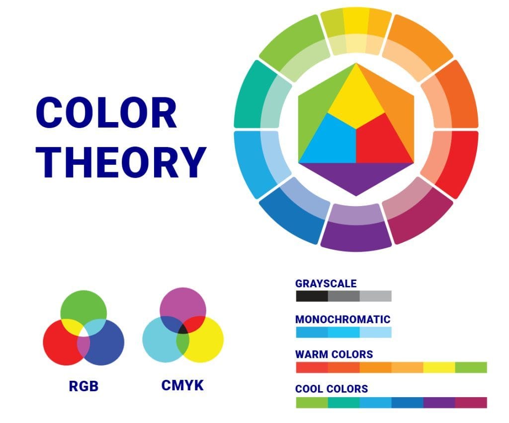
The Color Wheel: Your Design Foundation
The color wheel is a circular diagram that organizes colors in a visual way. It was first developed by Sir Isaac Newton and has since become an essential tool for designers.
The Three Types of Colors:
- Primary Colors: Red, Blue, Yellow
- Secondary Colors: Green, Orange, Purple
- Tertiary Colors: Red-Orange, Blue-Green, etc.
The color wheel helps designers understand relationships between colors and choose schemes that work well together.
Color Harmony: Making Designs Pleasant
Color harmony refers to combinations of colors that are aesthetically pleasing. When used properly, color harmony makes a design look balanced and cohesive.
Common Color Harmonies:
- Complementary Colors: Opposite each other on the wheel (e.g., blue and orange). Great for contrast and attention.
- Analogous Colors: Next to each other on the wheel (e.g., red, red-orange, orange). Ideal for a cohesive and calming look.
- Triadic Colors: Three evenly spaced colors on the wheel (e.g., red, yellow, blue). Offers vibrant contrast while maintaining harmony.
- Monochromatic: Variations of a single color. Simple and elegant.
- Split-Complementary: A base color plus the two colors next to its complement. Balanced yet dynamic.
The Psychology of Color in Design
Colors aren’t just visual—they trigger emotions and actions. This is where color psychology comes in. Understanding how colors affect mood and perception is crucial in branding and marketing.
Here’s a quick breakdown:
| Color | Emotion/Meaning | Common Use Cases |
|---|---|---|
| Red | Energy, passion, urgency | Sale signs, fast food, call-to-actions |
| Blue | Trust, calm, professionalism | Tech, finance, healthcare |
| Green | Growth, nature, health | Organic products, wellness brands |
| Yellow | Happiness, warmth, alertness | Promotions, children’s products |
| Black | Luxury, power, sophistication | Fashion, high-end branding |
Practical Application in Graphic Design
When working on any design project, applying color theory helps:
- Build a strong brand identity
- Create visual hierarchy
- Guide user behavior
- Improve readability and user experience
Why Learn Color Theory Through a Graphic Designing Course?
While self-study is useful, structured learning makes a big difference. A professional graphic designing course in Noida can help you:
Understand advanced color principles
- Practice with real-world projects
- Learn how to use Adobe tools for color selection
- Get personalized feedback from industry experts
- Master branding, UI design, and more
Tips for Using Color in Your Designs
- Start with a palette: Use tools like Adobe Color or Coolors to build harmonious palettes.
- Limit your color choices: Stick to 2–4 colors to avoid clutter.
- Test for accessibility: Make sure your text contrasts well with the background.
- Consider cultural meanings: Colors can have different meanings in different cultures.
- Stay consistent: Stick to your brand colors for a cohesive identity.
Final Thoughts
Color theory is not just about making things look pretty—it’s about strategic design. Mastering the use of color helps you create designs that are not only beautiful but also meaningful and effective. From emotional impact to visual clarity, color plays a central role in how your audience perceives your work.
If you’re serious about becoming a professional designer, enrolling in a structured graphic designing course in Noida can give you the edge you need to confidently use color and all other elements of design.