Data Visualization: Turning Numbers into Stories
Discover how data visualization transforms numbers into compelling stories, making complex data more understandable and actionable through effective charts, graphs, and visual tools.
Share this Post to earn Money ( Upto ₹100 per 1000 Views )
Data visualization is an essential skill in our data-driven world. By transforming complex data sets into visual formats, such as charts and graphs, we can better understand and communicate insights. This article explores the fundamentals of data visualization, its importance, and best practices for creating impactful visual stories.
Understanding Data Visualization
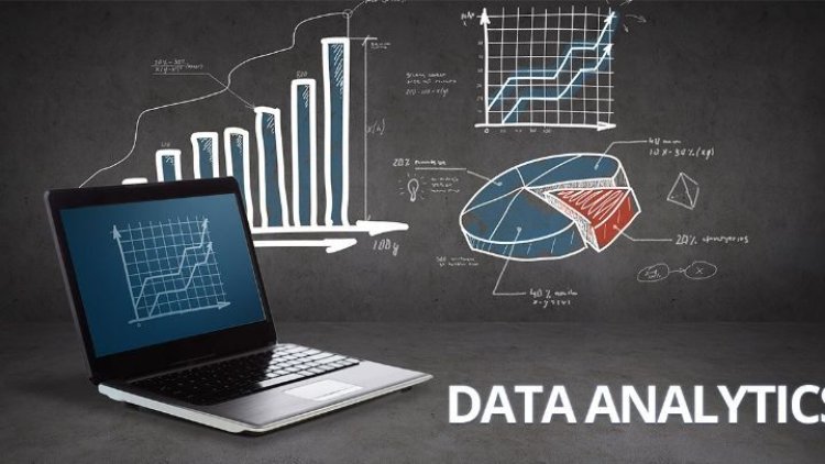
Data visualization is the graphical representation of information and data. Using visual elements like charts, graphs, and maps, data visualization tools provide an accessible way to see and understand trends, outliers, and patterns in data.
Why Data Visualization Matters
-
Simplifies Complex Data: Visualizations turn large data sets into easy-to-understand formats, helping viewers grasp difficult concepts quickly.
-
Reveals Insights: Visual tools can uncover trends and patterns that might not be immediately apparent in raw data.
-
Enhances Communication: Visualizations make it easier to share and explain data insights, fostering better decision-making.
Types of Data Visualizations
There are various types of data visualizations, each suited to different types of data and analysis. Here are some common ones:
Bar Charts
Bar charts compare different categories of data. They are ideal for showing changes over time or differences between groups.
Line Graphs
Line graphs display data points connected by straight lines, useful for tracking changes over periods. They are commonly used in time series analysis.
Pie Charts
Pie charts show the proportion of parts to a whole. They are effective for displaying percentage or proportional data but can be misleading if overused or used with too many categories.
Scatter Plots
Scatter plots use dots to represent the values of two different variables. They are useful for identifying correlations between variables.
Histograms
Histograms display the distribution of data points across different intervals. They are often used to show frequency distributions.
Best Practices for Effective Data Visualization
Creating effective data visualizations requires more than just choosing the right type of chart. Here are some best practices to follow:
Keep It Simple
Avoid clutter by focusing on the most critical data points. Too much information can overwhelm the viewer and obscure the message.
Use Color Wisely
Colors should enhance the visualization, not distract from it. Use colors to highlight key data points and ensure they are accessible to all viewers, including those with color blindness.
Provide Context
Include labels, titles, and legends to help viewers understand what they are looking at. Contextual information is crucial for making your visualizations meaningful.
Tell a Story
Every visualization should tell a story. Think about the narrative you want to convey and how your visual elements can support that story.
Be Accurate
Ensure your visualizations accurately represent the data. Misleading visuals can lead to incorrect conclusions and undermine trust in your analysis.
Tools for Data Visualization
Several tools can help you create compelling data visualizations, ranging from simple to complex:
Microsoft Excel
Excel is a versatile tool for creating basic charts and graphs. It is user-friendly and widely accessible.
Tableau
Tableau is a powerful data visualization tool that allows for interactive and dynamic visualizations. It is well-suited for more complex data analysis.
Google Data Studio
Google Data Studio is a free tool that integrates with various data sources. It is great for creating interactive reports and dashboards.
Power BI
Microsoft Power BI offers robust data visualization capabilities and integrates well with other Microsoft products. It is suitable for both simple and complex visualizations.
D3.js
For those with coding skills, D3.js is a JavaScript library that provides immense flexibility for creating custom visualizations.
Real-World Applications of Data Visualization
Data visualization is used across various industries to make data-driven decisions. Here are some examples:
Business
In business, data visualization helps track performance metrics, sales trends, and customer behavior. For instance, a company might use a line graph to track monthly sales growth or a pie chart to show the market share of different products.
Healthcare
Healthcare professionals use data visualization to monitor patient outcomes, track disease outbreaks, and manage hospital resources. A scatter plot might reveal the correlation between patient recovery times and treatment methods.
Education
Educators and administrators use visualizations to analyze student performance, attendance rates, and resource allocation. Histograms can display the distribution of student grades across a semester.
Government
Government agencies leverage data visualization to present demographic information, economic indicators, and public health data. Bar charts can compare employment rates across different regions.
Digital Marketing
In digital marketing, visualizations help analyze web traffic, campaign performance, and user engagement. Scatter plots might illustrate the relationship between website visits and conversion rates.
Learning Data Visualization
Whether you are taking a Data analytics course in Patna or any other city in India, understanding data visualization is crucial for making sense of complex information. A solid foundation in data analytics provides the skills needed to create effective visualizations that clearly and compellingly communicate data insights.
Conclusion
Data visualization is a powerful tool for turning numbers into stories. By simplifying complex data, revealing insights, enhancing communication, and telling compelling stories, visualizations play a vital role in data analysis and decision-making. Following best practices and using the right tools can help you create effective and impactful visualizations, making your data more accessible and understandable. As you explore the world of data visualization, remember that the goal is not just to present data, but to tell a story that informs, engages, and inspires.